I was going to work on the character creator next, and get a starter NPC in there to test conversations and story, but I saw some problems.
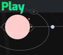
One, once people were in the last test, I noticed it’s pretty ghostly not being able to see where people are. I added a population counter on each area.
I hate how this looks, though. It’s just a little number there. It looks really ugly. I need another way to represent the population of an area. Maybe a growing circle from the center? Maybe a randomly placed dot for each person? It’d be weird not seeing the dots move, though.
If you guys have any ideas, you could post a photoshop in the comments or something
Two, some people were confused on how to move and tried commands in the chat like a MUD/MUCK. Hopefully the graphical buttons will stand out more and make them clear that you press those.
I also bound these to WASD and you can rebind them! There is a settings button where the keys change, and you can actually see them get rebound in real time.
These same keys will be used in the chat wheel.
I think moving around works really nice now. Now that I think of it, I should make it so you can just hit tab to jump between the chat and the game controls.
Next I’ll actually work on getting NPCs in the game for real this time.


